It is some time since I had a paint brush in my hand with an internal wall to cover neatly and economically. I have however been let loose on the garden fence . . . . . all 35 panel’s worth of fencing. I can assure you, that after the first foray into this world of fence colour, pleasing if boring mid brown,wax enhanced for wearability, I now know exactly how to achieve a good finish in very quick time. I avoid using those great wide and fat brushes sold for such a job. No, I use a much better quality 2 inch hair paint brush. I can weedle it in and out of corners of a fencing slat very easily now and get the edges of the fence posts done in two licks.
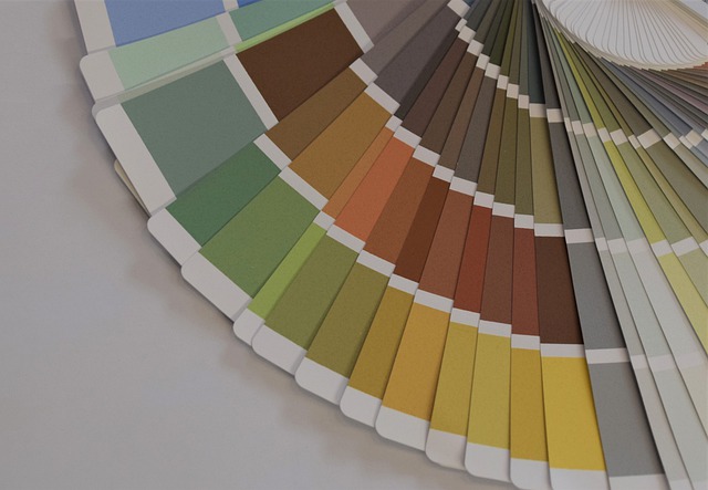
However, for indoor decorating for real, colour theory could be the answer to my queries. Most decorators in a professional capacity work to a 60-30-10 ratio which means that the decor space is divided into 60 for the main colour of the walls, the dominant colour overall. The 30 is a secondary colour, maybe striking upholstery and soft furnishings – to tone exactly with that dominant wall colour. The 10 is the ratio allowed for accessories, table lamps, covers or throws with a particular shade picked out to match as exactly the walls and furnishings. The room will remain balanced without any one colour or hue screaming at you upon entry to the room. Ahhh bliss!